GZF
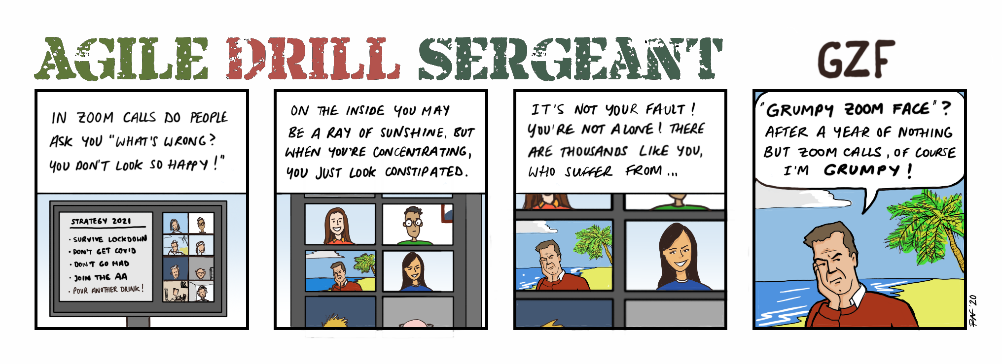
So I’ll give you one guess, who is often accused of having a grumpy zoom face! 😏
Reminder to self: don’t use so many colours! Totally destroyed the timebox… Here’s the thing about the “creative process”. The first panel is shite. I made up the bullet-points just to fill the space. I did not colour the individual boxes in the way they should be, based on the following panels. In the following panels, many of the lines aren’t cleanly finished and there’s little shading. In fact, shrinking the larger versions of the drawings actually made things worse. And I don’t think I hit the optimal choice of colours. And I have never taken the time to acutally use a comic font for my textboxes – instead relying on my inconsistent handwriting.
That’s what a creator thinks. It could always be better. From their point of view. But from the readers’ point of view? I doubt it. I very much doubt that a single reader of my cartoons is actually interested in the artwork. They’re reading the cartoons for the joke – which may often leave them disappointed! But because the narrative, the joke, the punchline is their goal, other aspects along the way are just supportive and basically uninteresting. Which is why I apply agile thinking to product an MVC – minimal viable comic – so that I don’t spend forever perfecting details which are irrelevant to the average reader. And for the connoisseur, only prove that I am the amateur that I admit to.
